Maroon, Gold, Black, and White.
UNIFORMITY is a new column from DieHard dedicated solely to the uniforms and styles of the Arizona State Sun Devils.
We all saw an overwhelming interest around the topic of “unis” when Sun Devil Athletics was re-branded by Nike in the Spring of 2011. Surprisingly, the buzz hasn’t stopped since.
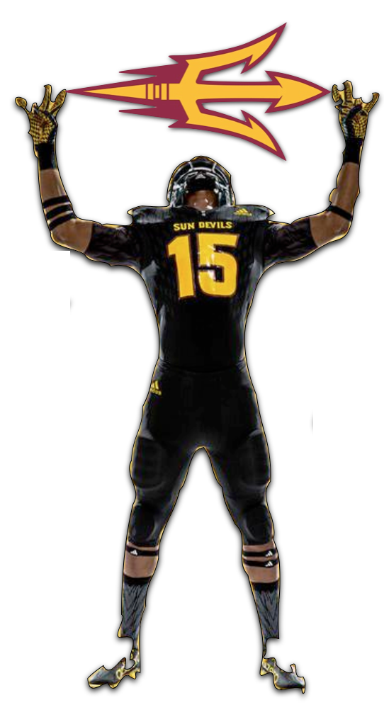
The Age of Adidas ///
The fanfare around the Sun Devils’ athletic style received a nice jolt when the three stripes of Adidas inked an agressive 7-year deal with Arizona State Athletics valued at over $33M to start the year.

The Three Stripes
If you asked the average Sun Devil fan in January about what their expectations were from Adidas, they’d probably say that it spelled disaster for the aesthetics of the Ol’ Maroon and Gold (and black… and copper… and gray). But here we are at the start of September, and there‘s quite a different tune echoing between the buttes.
ASU and Adidas released the new football uniforms on July 30th. It was the first tangible example of what we might see moving forward with the new apparel partnership. Right out of the gate, it was clear that the decision makers stayed conservative and took the “if it ain’t broke, don’t fix it” approach.
What’s New
To start, ASU’s essential PT*42 patch remains at the base of the collar. The “ASU” on the sleeves has been eliminated. The prior shoulder design, which was styled after the points of the pitchfork, has been streamlined a bit and moved out wider due to the available space where “ASU” was before.
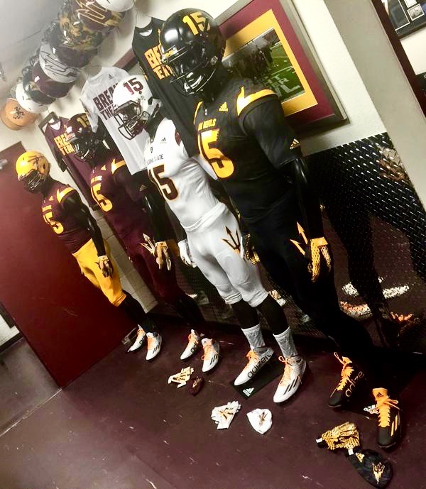
Sun Devil Football’s Base Uniforms: Maroon, Gold, Black, and White
The change to the shoulder area has made way for a larger font displaying “Arizona State” (home/away) or “Sun Devils” (black jerseys) on the chest. On the back of the jersey, Sun Devil Bold font is now used for player names instead of the thinner, generic print used in years past.
Something not lost on fans is a prominent pitchfork on the left thigh which is noticeable, but not overstated. It’s one of those new elements that took some fans back for a moment, but the objections weren’t too loud. Looking ahead, I believe that this is a detail that will grow on people.
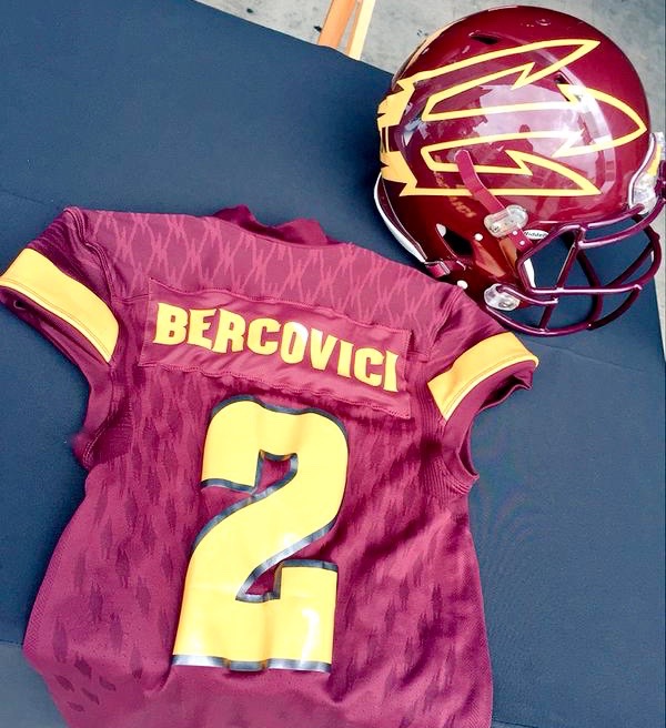
Maroon jersey and Maroon helmet with Oversized Fork
Fan Reception
The reveal, overall, was a success. What was worry and concern for many has given way to wide-spread satisfaction throughout Sun Devil Nation and some excitement to boot.
We have seen detractors who refuse to accept the fact that the ever-popular Nike Swoosh has been replaced with the three stripes mark of Adidas. I’ve personally never subscribed to the pretentious ideal that the name on a tag makes a difference. To me, a $300 pair of jeans from 7 For All Mankind aren’t any better than my $60 pair of Levi’s which look just as good and are sure to last a nice, long time.
In all, the base uniforms were a pleasant surprise to a skeptical community. I admit to being a part of that skepticism given some of the disasters Adidas had released for other teams, but they delivered when it came to the standard jerseys.
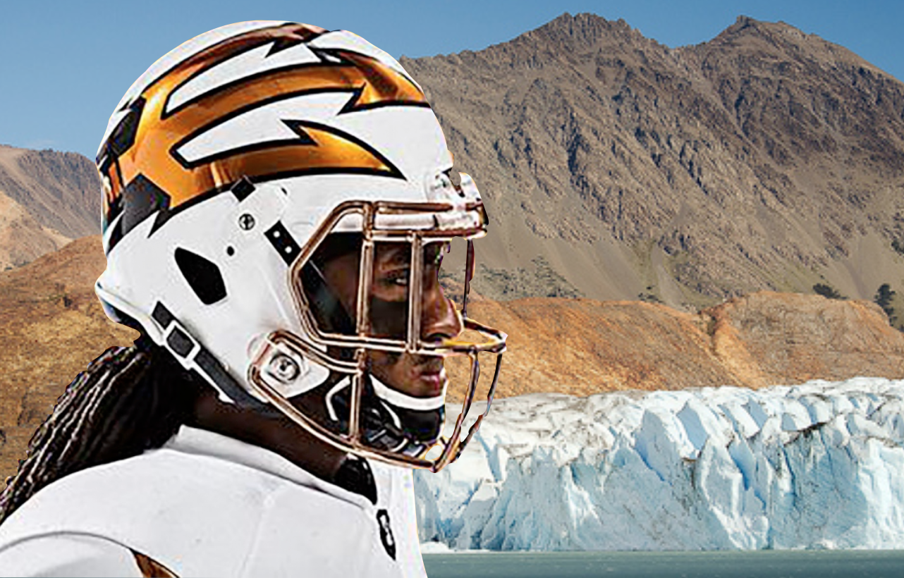
Desert Fuel’s Second Coming: Desert Ice /// Below
The New Alternate
This brings us to the alternates. Three, to be exact- the first of which will be worn when the Sun Devils square off with Texas A&M in Houston on Saturday.
“Desert Ice,” was the name that was hyped by ASU and Adidas, and the skepticism rose again amongst Sun Devil circles. “Okay, Adidas did a good job with our base uniforms, but the alternates could be atrocious.”
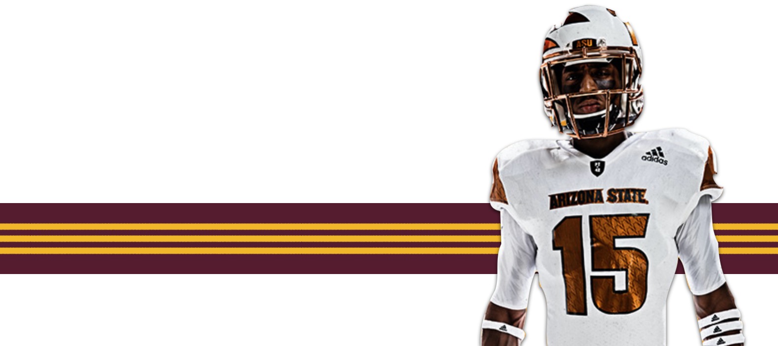
Those concerns were soon squelched with the release of Desert Ice: a white base from helmet to cleat accented with clean, copper and onyx detailing. Arizona State once again does justice to the state of Arizona by starring copper, the state color, in an incredibly creative fashion. The look is unmatched by any school trying to capture the Arizona brand in a forward thinking way.
The Details
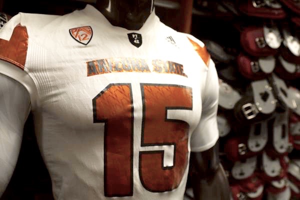
Desert Ice jersey front
The white helmet features the popular oversized pitchfork utilized on the Maroon Monsoon uniforms and the all-white “Storm Trooper” uniforms. The key difference is that the pitchfork on Desert Ice is filled with color rather than a simple outline.
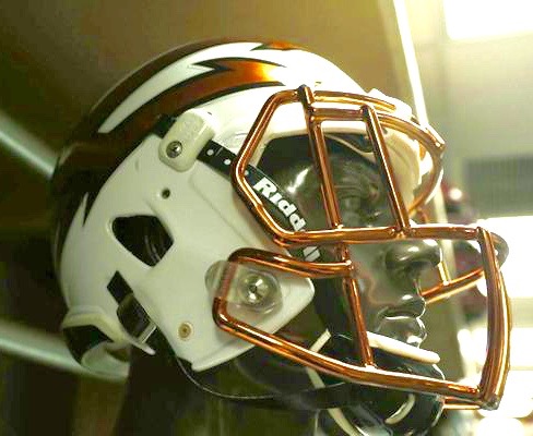
Desert Ice Helmet
The onyx outline makes that solid copper fork pop off the clean white color, while the opposite side of the helmet features each player’s number. This asymmetrical look doesn’t appeal to all fans, but at the same time people really like the oversized Fork. The helmet also sees the return of the bold copper chrome face mask which was used in last season’s Desert Fuel alternate.
The jerseys feature “Arizona State” in onyx, outlined by copper. The numbers are the opposite: copper with an onyx outline. Adidas gave the jersey numbers and other copper filled portions of the uniform a subtle touch unique to Arizona State. It might not be instantly recognizable, but the pattern features the bottom spike portion of the pitchfork logo running diagonally upward and to the right.
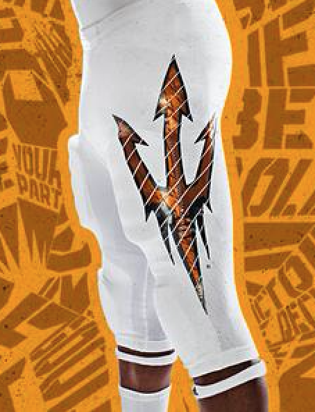
Oversized Fork on the left thigh
The white pants of Desert Ice also have a pitchfork on the left thigh. However, this pitchfork is copper broken up with white pinstripes, again running diagonally up and to the right. Something else worth noting is that the Desert Ice pitchfork is larger than the standard pants. It begins at the knee and runs all the way up, nearly to the player’s waist.
Finally, the Adidas cleats are a clean white with copper pitchforks on the inside of each shoe. They also have copper chrome spikes below which almost look metal. This nice detail will allow Texas A&M’s defense to see the flashes of our state while getting outrun by Baby Beast Mode, Kalen Ballage and “Gump” Hayes.
Fan Opinion
Naturally, when there is any deviation from the norm, there will be a reaction. Let’s start with the bad, since there’s so little of it. First of all, finding fans that disliked the Desert Ice design proved difficult, but when I did, the largest argument was that “it is not maroon and gold.” As a proud traditionalist, I can respect that beef, but I don’t feel it has legs in this case. Arizona State introduced copper on the gridiron in 2014 in successful fashion, and with a massive win over then tenth ranked Notre Dame.
As for the rest of Sun Devil Nation, the reception to Desert Ice was enthusiastic. People were talking about how great it looked. Emojis of snowflakes and flames flooded the ASU twitter stream. More than anything, the players love it, and therein lies what matters most.
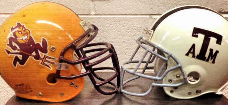
An old-school touch #ForksUp
With a huge match-up against an SEC power ahead, what could be better than a great look to match the great season the players have been working so hard towards? This uniform brings the team unity and excitement. UNIFORMITY, if you will. It will have the Devils ready to rumble in Houston.
Sun Devil Football brings us DieHard Sun Devil fans together. Our pride in the team, our colors, and the uniforms all play a role in galvanizing Sun Devil Nation. We are the best looking program in the country and our uniformity is only going to get better with each passing week.

Stay Gold on at DieHard-Apparel












Leave a Reply
You must be logged in to post a comment.