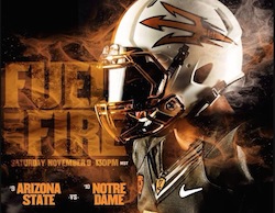
1:30 pm MT Kick-off in Sun Devil Stadium
I hate grey football jerseys.
Nothing turns a cool uniform template into a mundane mess like the color grey. It’s boring, usually not a part of the team’s color scheme, and often leaves me with unfulfilled expectations.
When I watch Texas Tech, I expect to see red and black. When Miami plays, I expect to see orange and green for the duration of the afternoon. If Tennessee’s on, that light orange should be as well. All of these schools have grey alternates. In my humble opinion, all of them pale in comparison to their respective university’s regular duds.
Colors are a part of the basic fiber of a university. There’s a reason our student section looks like a golden sea on Saturday nights. It’s our color.
So when I heard ASU had debuted a grey alternate, I was decidedly bummed out. A significant part of my game day experience is seeing ASU ball out in a new combination of maroon, gold, black, and white.
I was certain this smoggy alternate was going to be disappointing. Begrudgingly, I clicked the link.
Wow.
Even I, hater of all grey, dig these slick beauties. And a couple months later, on the week of their debut, I’m still marveling at what the Sun Devils will be wearing in one of their biggest games in the Todd Graham era.
To my earlier point, colors are important to a school’s identity. What stands out most to me about these new jerseys is that they have zero school colors. ASU didn’t try to slip charcoal or copper into maroon and gold, they separated completely and let those colors stand on their own.
When ASU comes out of the tunnel Saturday afternoon, they will look different than any squad that’s ever sprinted out onto Sun Devil Stadium. I like that.
These “Desert Fuel” jerseys do not look forced. The colors are complementary, and the heavy use of white balances the dark tone well.
The blocking is also well done. The white frames the other colors, instead of mixing in with a stripe or a pattern. I am not distracted but intrigued.
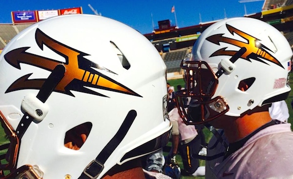
My favorite feature is the numbers. The copper-to-white gradient stands out against the dark background and goes really nicely with the helmet (white with copper face mask).
There is a lot of balance in these uniforms. Every color has its own place to shine.
ASU created quite the stir before last year’s Notre Dame game by debuting helmets with a flame pattern on them. Those helmets, while no doubt unique and flamboyant, did not help the Devils take home the victory.
This year’s metallic ensemble is pretty appealing on it’s own, but seeing a victorious Damarious Randall gallop towards the student section with a group of grinning, copper-clad teammates behind him might make them look juuuuuuust a little bittle better.
Don’t ya think?













Leave a Reply
You must be logged in to post a comment.